Data to Insights: WELL Labs Tool Sifts Through Crop Statistics and Finds Cropping Patterns Within
The Directorate of Economics and Statistics (DES), Ministry of Agriculture, publishes centrally-aggregated statistics on seasonal cropping patterns at the district level. This data can be an enormous source of insight if we know what questions to ask.
At WELL Labs, we developed a tool to sift through this dataset and look for stories within.
Agriculture in India is not a monolith and neither is it stagnant. The variety of cropping patterns we see in the plains in the north vary from the drylands in southern India. Long-term trends can be observed in changing cropping patterns that are driven by one or more forces, typically, market demand, environmental constraints, technological innovation (like hybrid seeds) and policy changes.
Water conservation programmes often attempt to intervene in agricultural practices but without a full understanding of the larger picture and trends at play. They rely on anecdotal evidence since easy-to-access data can be a limiting factor. However, data — when available — provides a reliable way of confirming or disputing anecdotal evidence. Treating it as one such starting point can contribute to the success of programmes.
In this blog, we provide some examples of how reading and interpreting crop statistics can help build a more complete picture of a landscape. All images in this blog are screenshots of graphs based on prompts entered in the app.
Identifying major crops in a district or state and changing patterns
We might begin with a question pertaining to a limited geography — a state or a district — and ask what the most important crops in that geography are and whether this has changed over time.
Some districts are relatively unchanged in the last two decades. The figure below (Figure 1a) shows one such example of Jalandhar, Punjab, where there is little variation in cropping patterns, it continues to remain dominated by rice and wheat. Although, in terms of area, there has been a significant increase in rice sown.

Figure 1a: Cropping pattern in Punjab’s Jalandhar district.
Other districts show remarkable change in cropping pattern in the same two decades. Figure 1b shows Aurangabad, Maharashtra, which has changed from a landscape dominated by jowar (sorghum) and bajra (pearl millet), to one that primarily grows cotton.

Figure 1b: Cropping pattern in Maharashtra’s Aurangabad district.
The data itself doesn’t explain what caused the change in cropping pattern, but it does offer a good starting point for investigation. Has cotton expanded because of environmental changes (cotton tends to grow better in degraded soil compared to other crops), or was it an increased market demand for cotton in comparison with the crops it replaced cause this shift?
One can also use the app to filter and view numerically the largest changes in crop area in a district. In the table below, for instance, we see the major positive and negative trends in crop area in Cuddalore district.

Figure 1c. Changes in crop area in tabular format.
Here, it’s notable that maize expanded from almost nothing to 22,435 hectares in the district over two decades. Moong (green gram) shows large growth too. On the other hand, sugarcane is one prominent crop that is shown to have declined in terms of cropped area. We typically have seen the growth of cash crops such as sugarcane in the country due to the reliable profit it provides. A significant decline must mean there is a strong factor driving down its production.
The tool shows projections too
A keen observer might also notice that these charts don’t only show cropping patterns until 2023, they go beyond that until 2028. In fact, the official statistics published by the Ministry of Agriculture lags behind. As of July 2023, the latest published data for most states is of the year 2019.
To construct the charts above we have applied a simple linear model to extrapolate the trendline for each individual crop for up to 10 years. This is a simple yet powerful analysis that allows us a preview of what cropping patterns in a district might look like in the coming years and help plan for the same.
The tool captures changes in area, production and yield
In the table in Figure 1c, you would notice that there are three parameters listed for each crop. Area (ha), production (tonnes) and yield (tonnes/ha) are three important variables we find in the crop statistics database; there are related by the simple formula:
Yield (tonnes/ha) = Production (tonnes) ÷ Area (ha)
After examining cropping patterns at the district scale, as shown above, one can also examine crop-specific sowing patterns along with production and yield across entire states.
In Figure 2a, for instance, we see the trajectory that soybean is taking in the state of Maharashtra. While the blue line shows a steady increase year-on-year in terms of area sown, the average yield is, in fact, decreasing. In years where the state faced severe droughts, 2009 and 2015, sharp decreases in yield are discernible.
If we extrapolate into the future (see dashed line), we can project that the area sown and production will increase even further, despite decreases in yield.
Figure 2b below is that of a similar Area-Production-Yield chart, but this one shows a different trend in cropping pattern. The cropped area and production of groundnut in the state of Karnataka has fallen over the last two decades. Yields have remained relatively constant.


Figure 2a (above) shows soybean in Maharashtra. Figure 2b shows groundnut in Karnataka
With knowledge of these trajectories of different crops in each state, what questions can we ask to understand the ‘why’ question? The data above simply shows trajectories; it doesn’t tell us why these trends are happening.
When investigating the ‘why’ question, one must typically consider and rule out bad data quality as a factor before going on to other hypotheses. For instance, if a dataset for a particular crop or district has large gaps or outliers, those could indicate poor quality data.
We can even use the data as initial hypotheses in conversations with grassroots organisations and communities, and triangulate first whether the data reasonably represents the ground reality. If it does, then we can go on to ask what the drivers of change are. On the other hand, if ground reports contradict the data, we can develop alternative hypotheses to explain data inconsistencies.
Check out our agricultural statistics tool and let us know what you think.
If you need help to do an analysis of this nature for a district that you work in, please reach out to us at welllabs.jaltol@ifmr.ac.in
Edited by Kaavya Kumar
If you would like to collaborate with us outside of this project, write to us. We would love to hear from you.
Follow us and stay updated about our work:
Related Posts
Related Posts
-

Can Farmers Make More Money While Using Less Water?
Farmers need to be able to transition to crops that use less water but yield a higher profit. This was the basis of an agent-based modelling exercise we did in six states.
-
Five Lessons We Learned As An Ecosystem Builder
Ecosystem builders connect, empower, and collaborate with others to lift up the whole community to achieve its potential.
-
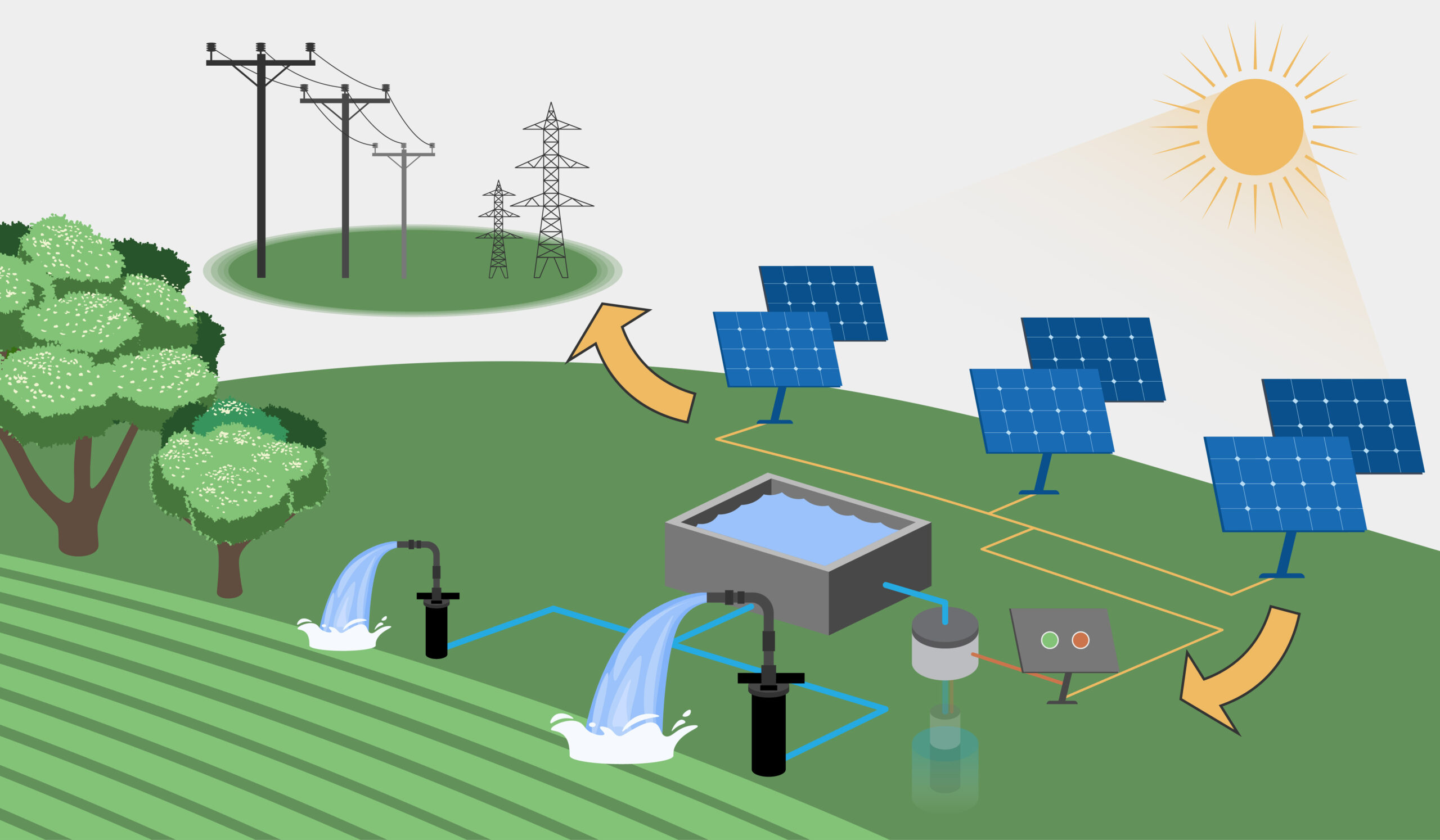
How Are Farmers Likely to Respond to Solar Irrigation? Insights from Our Modelling Exercise Covering 6 Districts
To our knowledge, this is the first research study that has attempted to apply the agent-based modelling method in the context of solar irrigation and its likely impact on farmers’ incomes and grou...
-
Data to Insights: WELL Labs Tool Sifts Through Crop Statistics and Finds Cropping Patterns Within
In this blog, we explain how to use the agricultural statistics tool we developed that makes it easy to read and interpret data and thus build a more complete picture of a landscape and its croppin...
-
Can Playbooks Promote Green Rural Livelihoods? Insights from Conversations With CSOs
Under the Green Rural Livelihoods project, we are working with Rainmatter Foundation to create how-to guides and playbooks.
-
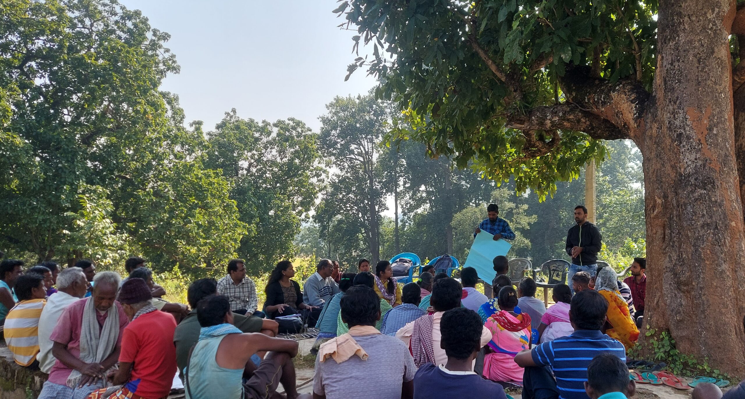
Field Notes from Lohardaga: How a Grassroots Organisation in Jharkhand Shares Knowledge
As part of the Green Rural Economy project, we visited Lohardaga and got insights from the ground on how grassroots organisations like PRADAN support local communities with best practices on land a...