How Often are India’s Farming Patterns Changing? With IIT Delhi, We Turn to New Land Use Maps for Answers
This blog was co-written with Chahat Bansal, PhD scholar at the Indian Institute of Technology, New Delhi. She is one of the authors of the published paper on IndiaSAT.
If you would like to cite the original paper, here’s a suggestion: Bansal, C., Ahlawat, H. O., Jain, M., Prakash, O., Mehta, S. A., Singh, D., … & Seth, A. (2021, June). IndiaSat: A Pixel-Level Dataset for Land-Cover Classification on Three Satellite Systems-Landsat-7, Landsat-8, and Sentinel-2. In ACM SIGCAS Conference on Computing and Sustainable Societies (pp. 147-155).
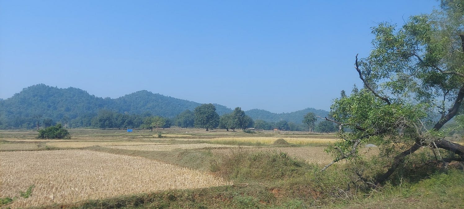
Landscapes change. The causes for this are plenty – a large patch of trees could be felled for a construction project, a lake dries up as the climate warms, a forest could drastically shrink because of encroachment or a once thriving farm land could turn barren as extreme weather and soil degradation impairs cultivation.
Through satellite imagery, we have eyes in the skies that can capture these changes on a global scale and down to minute detail. Remote sensing has advanced by leaps and bounds over the past few decades, providing researchers and policymakers with valuable insights on how our land is changing and prompting questions on why certain trends are underway and what it bodes for people and places.
We are interested in how agricultural landscapes are changing.
In a country like India, it is not only a question of food security for the world’s most populous country. Millions of people depend on the state of farmlands for their livelihoods. It is also a sector that is vulnerable to factors that interfere at different stages of the farming process. Hotter, drier weather and extreme weather events affect sowing and harvest. Intensive farming practices that require copious amounts of pesticides and fertilisers affect yield in the long term and leave farmers vulnerable to debt. The worst off are rainfed farmers and those who hold small landholdings of less than two acres.
Given this dire context, the role of satellite imagery assumes greater significance. We need to be able to track changes in land cover accurately and periodically because this is key to informing agricultural policies and watershed management. Are more plots of land turning barren? Have farms diminished from three cropping cycles a year to one because there simply isn’t enough water to sustain more?
This is where IndiaSAT’s land use maps come in.
IndiaSAT is research work spearheaded by the Indian Institute of Technology-Delhi focusing on improving land use land cover (LULC) classification. These maps place special focus on cropping frequency in the agriculture fields of the country, i.e. the number of farming cycles a tract of land is used for. The greater the frequency, the more a farmer can earn. Classifications include single cropping, double cropping and triple cropping. In India, there are two main cropping seasons. One is kharif, i.e. crops that are sown before the onset of the southwest monsoon in June. The second is rabi, the ‘winter’ crop that is sown after the monsoon around mid-November. The other non-cropping categories are built-up, barren, trees and water bodies.
These maps have the ability to trace changing patterns of agricultural intensity that are rapidly getting affected by dwindling water resources and widespread unsustainable farming methods.
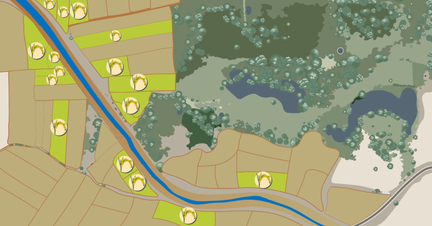
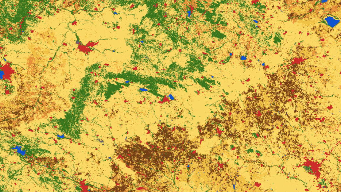
Take a look at this map. This is an example of an LULC map because it shows what purpose a tract of land is used for – from tree cover to built-up settlements to water bodies to cultivated land. What is remarkable about these maps is that they also reveal even finer details about the cropland, i.e. how often it is farmed.

This is a comparison of two land use land cover maps — for 2017 and 2021 — of the district of Raichur. The decline of triple cropping here indicates that there are stresses like poor water availability or degradation of soil that may have prompted farmers to carry out fewer crop cycles.
Comparing it across different points in time, in this case, the years 2017 and 2021, gives more insights on how the land has changed and what these trends mean for the region. The decline of triple cropping here indicates that there are stresses like poor water availability or degradation of soil that may have prompted farmers to carry out fewer crop cycles. Disclosing such spatial agricultural patterns yearly, right down to plot level, can provide crucial, periodic evidence for annual water planning and agriculture policy adjustments.
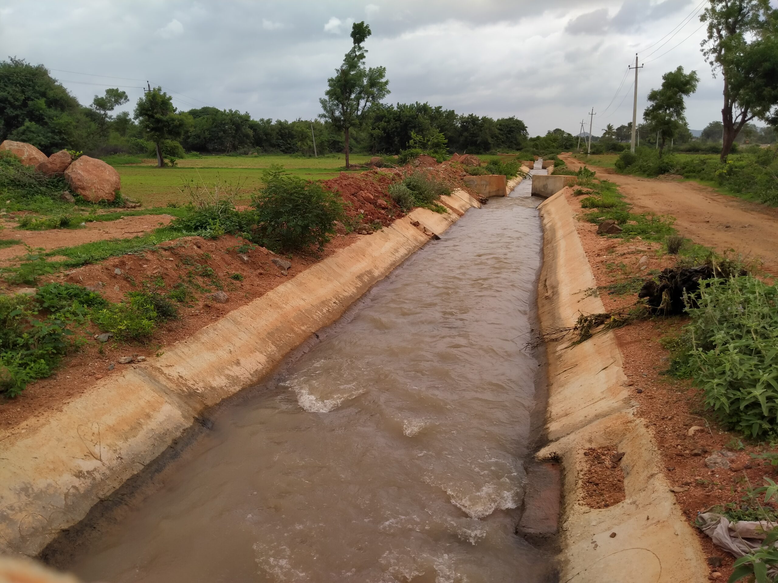
WELL Labs has partnered with IIT-Delhi and Gram Vaani, a social enterprise incubated at IIT-Delhi, to understand the potential of this tool and sharpen its accuracy through field observations or ‘groundtruthing’. Our grassroots partner organisation in Raichur, Prarambha, led the data collection process.
This is a map of Raichur, a drought-prone district in northern Karnataka. Researchers under the Rural Futures programme have been studying the landscape and agricultural practices and, pathways to land restoration.
How was IndiaSAT developed and what gaps do these land use maps address?
Historically, government records such as data from revenue collection or agriculture inventories, or manual observations for a limited area, were used to develop LULC maps . These were long, tedious processes that led to a lag between the information observed and eventually delivered in the form of a map. This means outdated and inaccurate results.
But with satellite imagery and machine learning, timescales to produce a map have shortened dramatically. An example of this is Dynamic World by Google and the World Resources Institute, which provides real-time land cover data. There are four steps involved in the creation of such satellite-based LULC maps. First, researchers develop an algorithm for classification, i.e. defining categories such as built-up or water or cropland. Then, they feed training data perform the classification. This means they train the model to interpret certain kinds of pixels in an image as farmland. They then validate the trained model – has the machine learnt right? If the model works well, it is then used to classify relevant satellite data.
IIT-Delhi researchers used a machine learning approach to develop IndiaSAT.
This approach combines what’s called ‘random forests’, which collates multiple different decision trees to arrive at one result, and ‘unsupervised classifiers’ in Google Earth Engine (GEE) to produce annual scale maps, beginning 2016 until the hydrological year 2021-22. The approach uses input images from Sentinel-1 and Sentinel-2 satellite data with the aim to achieve 10-metre resolution for the final maps (currently, they have a resolution of 30 metres).
Read | Jaltol & Water Security: How Do We Track Impact at a Finer Scale?
Other, similar products are available globally, including Landsat-Derived Global Rainfed and Irrigated-Cropland Product (LGRIP) and Global Irrigation Areas (GIA) that offer a distinction between rainfed and irrigated areas. However, the coarse resolution of the products limits its application in India. The National Remote Sensing Centre (NRSC) provides land use information on the Bhuvan platform, where the highest resolution available is 56 metres. However, these maps are currently available in PNG format, which is difficult to process for other applications (a PNG is a flat image, while a raster file is more appropriate for GIS functions). The lack of clarity in terms of the methodology also hinder the replicability of these maps.
A land use map defining cropping frequency is a one-of-a-kind product being produced for India.
We follow a hierarchical classification approach, by first classifying areas into four classes of built-up, barren, water and greenery.

We then break up the ‘greenery’ class into trees and crops. Finally, we separate the cropping class into single-cropped, double-cropped, or triple-cropped. Different algorithms and data sources are used at each stage.
The lack of large-scale verified ground data deems it necessary to decipher clusters of ‘spectral signals’, each corresponding to a category. A spectral signal basically means the unique ‘signature’, i.e. the wavelength emitted or reflected by a certain surface – be it vegetation or built-up land.
We were interested in spectral signals that represent Normalized Difference Vegetation Index (NDVI), which depicts the extent and health of greenery on the land through peaks and troughs. This is what enables us to hone in on cropping frequency, evident from the images below.
In the first image below, you see a satellite image of a single-cropped field in Raichur district. The graph next to it peaks only around September, indicating that this land is cultivated once a year, hence, single-cropped. The second image is of a double-cropped field in Raichur. The chart next to it shows the NDVI line peaking twice, indicating that this plot of land is farmed twice a year.


We established accuracy in land use by groundtruthing in Raichur.
While a machine learning-based classified land use map is as good as the ‘training data’, it is necessary to establish accuracy using ‘validation data’. We verify the cropping patterns by corroborating findings with ‘ground truth’ data. We can source the data from high resolution satellite imagery and open-source information through Google Earth and Open Street Maps. However, there are limitations to seasonal observations such as, in this case, changing crop type.
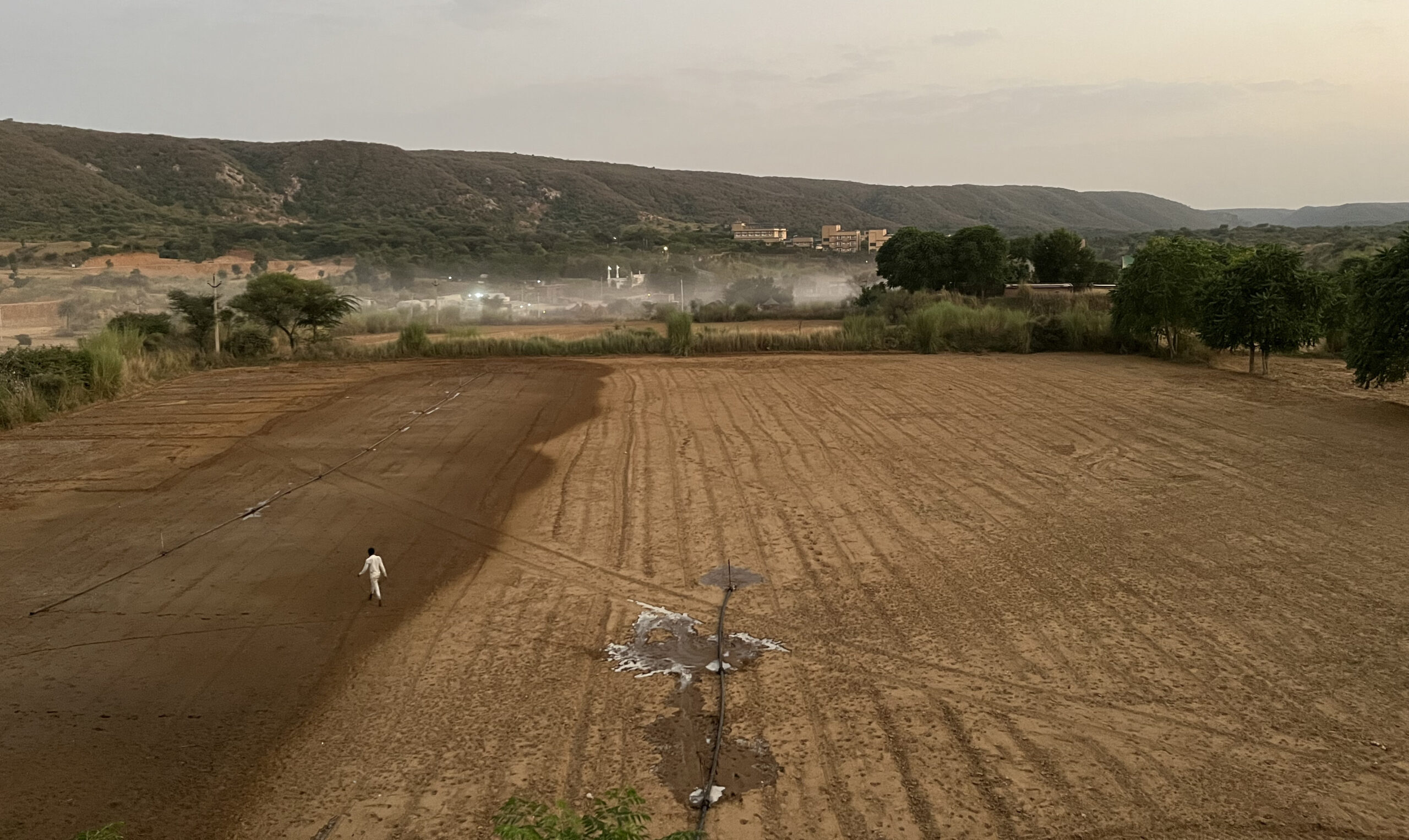
IndiaSAT sought to verify the cropping patterns for Raichur district. Challenged by scarcity in secondary datasets, gathering field information was the best alternative. WELL Labs spearheaded the process of data collection with Prarambha, a CSO that works to restoring degraded agricultural land.
We trained enumerators to collect information from farmers on the annual crops grown between 2021 and 2023, along with their sowing and harvesting dates. We performed this using the QField app that operates both offline and online, and directs the data to a server. Gram Vaani helped with the technology infrastructure to set up the data collection process, and subsequent cleaning of the data. We determined that information from a total of 251 fields in Raichur district was useful and completed it in the months of April and May 2023.
Read | Restoring Landscapes and Improving Farmer Income, the People-Centric Way


WELL Labs and Prarambha train enumerators (left). A screenshot of the Qfield app used for data collection (right).
There are often gaps in the process of data collection.
While the intent is to capture good quality field information, there is a risk that real-world responses are not clear. One way to partly bridge the gaps is by having good field knowledge and designing the questionnaire accordingly. However, in order to fully capture the range of possibilities and scenarios, validation data collection remains an iterative process. This process is carefully moderated; it is important to check the collected data for logical correctness.
From the first round of field surveys a few lessons have emerged:
- Relying on farmers’ memory recall isn’t foolproof as it can lead to recording partial information. For example, while farmers report a single season of cropping on their field for a year, it need not necessarily mean that in the other seasons the land remained fallow.
- Several times, the date of harvesting was before the sowing date of the crop. Challenges with operating the app or human error could result in these issues. This could mean the enumerator entered incorrectly or they could reflect an issue with the app.
- We also noted that there were long duration crops that did not fit the conventional time window of kharif and rabi crops, leading to a lack of interpretation of the cropping season. For example, farmers might harvest long duration crops like paddy sown in June in the rabi season. This leads to confusion as to which cropping cycle it belongs to.
To be able to respond to such errors quickly, it is necessary that the process of moderation is real-time. It should be possible to reach numerators within a short time window to cross-check entries.
Throughout this process, the attempt is essentially to forge a stronger connection between the researchers at the technology end with the field experts who have a strong understanding of the cropping varieties, their phenology and interconnection between land and water resources. This will allow us to achieve robust land use maps that inform us about the agriculture patterns.
In the second part of the blog series on IndiaSat LULC maps, we will explore two use cases on agriculture and water management.
Clarification: An earlier version of this piece said that the National Remote Sensing Centre (NRSC) provides land use information on the Bhuvan platform, but the maps have a resolution of 500 meters. This is incorrect and the resolution they provide is 56 meters. We apologise for the error and thank Porchelvan Anbarasu for pointing it out.
Edited by Kaavya Kumar
If you would like to collaborate, write to us. We would love to hear from you.
Follow us and stay updated about our work:
Related Posts
Related Posts
-
Field Notes from Jharkhand: Testing Jaltol on The Ground With WASSAN
By collating secondary data and allowing for grassroots communities to input specific primary data, Jaltol can address the data and technical gap that impairs water budgeting and rural water planning.
-
Drinking Water for Every Rural Household: A Tamil Nadu Village Highlights Challenges
We visited Nadiyam, a coastal village in Tamil Nadu, to examine water supply under the Jal Jeevan Mission and the challenges in sustaining piped drinking water access in rural areas
-
Rural Water Security: How Our Vision for Jaltol Has Progressed
WELL Labs is co-developing with its partners simple user-friendly tools, under the Jaltol framework, to help us diagnose the magnitude of water mismanagement and track our progress towards water se...
-
How Often are India’s Farming Patterns Changing? With IIT Delhi, We Turn to New Land Use Maps for Answers
Remote sensing data validated through reports from the ground can capture changes in spatial agricultural patterns down to plot level. This blog sheds light on land use maps developed by IIT Delhi ...
-
Remote Sensing in Rajasthan: Can Jaltol Buttress Traditional Johads?
We team up with Tarun Bharat Sangh to see how remote sensing can aid planning, impact evaluation and scaling up for johads, the traditional earthen embankments that are key to water conservation ef...
-
WELL Labs Partners with IHE Delft, ACIWRM to Develop Community-Driven Data Solutions
WELL Labs has partnered with ACIWRM and IHE Delft to understand and improve community-driven applications of remote sensing data in India’s Krishna river basin.